
- 17Apr2015
-
How to create a waterfall chart in Excel
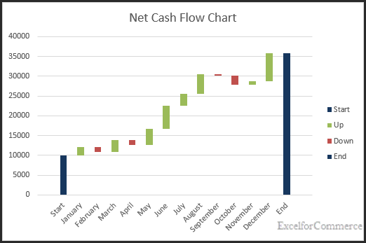
A waterfall chart is also called as a cascade chart or a bridge chart. This type of chart is not a built-in chart option in excel. However, we can create one by using a modified stacked bar chart by carefully arranging the data.
Let’s take an example of net cash flow. Here, we are interested in finding which month the business did well and in which month it did not do well.
Step 1: Arranging data.
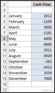
Assume that we have data for cash flow for one year as shown in the image below.
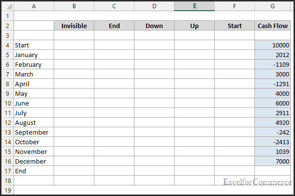
Now let’s insert 4 new columns in between to determine Invisible, End, Down, Up and Start values to create series for chart.
Step 2: Formulas to populate the Invisible, End, Down, Up and Start values
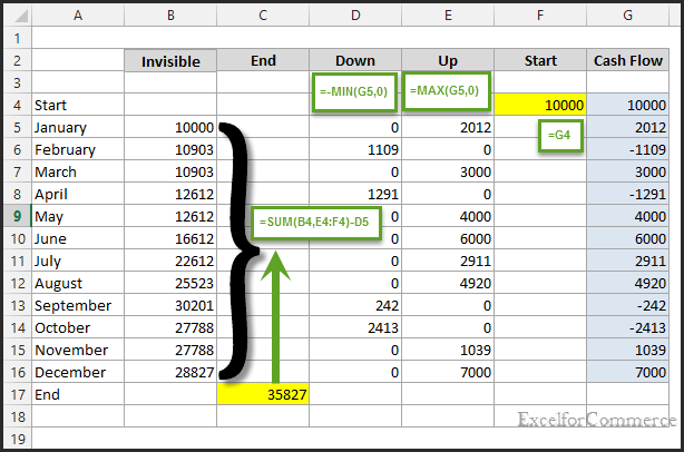
Start is nothing but Cash flow
“=G4”
Down is minimum between that month cash flow value and ‘0’. We multiply this value to negative to get a positive value. Populate the same formula till December
“=-MIN(G5,0)”
Up is maximum between that month cash flow value and ‘0’. Populate the same formula till December
“=MAX(G5,0)”
Invisible is the invisible series that we format later to show the UP and DOWN values as floating. This is the sum of above value with Up and Start value and subtracting current month Down value. Populate the same formula till End
“=SUM(B4,E4:F4)-D5”
End value is shifted to End column. So, as to put end in different series
Step 3: Creating chart
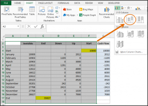
Select the whole table except Cash Flow column as these values are already in Up and Down columns and click on 2D stacked chart as shown in the image below.
Step 4: Formatting chart
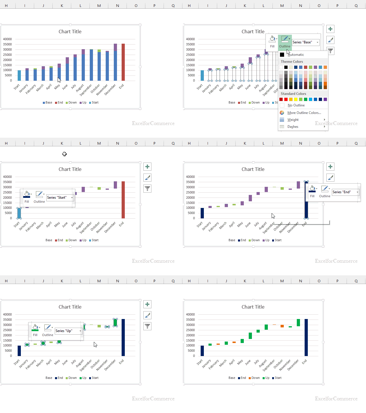
Now, let’s format “UP series with Green” and “DOWN series with Orange” and “Start and End series with Dark Blue”. We need to remove fill and outline to the base series to make the UP and DOWN values floating. For reference have a look at the below image.
Have any Queries? Feel free to contact us here
- 17 Apr, 2015
- Excel for Commerce
- 0 Comments
- Excel Consultant, Excel Expert, waterfall chart,

Comments